|
|
|
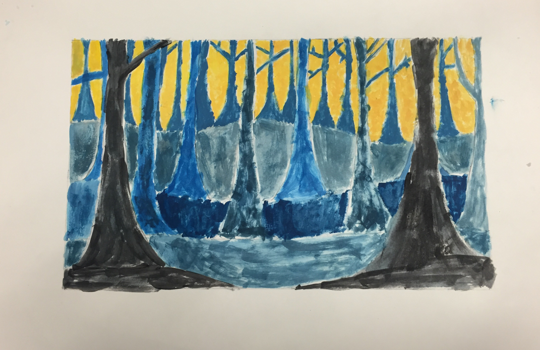
1/20 This is my pre final of my final of my spooky trees, the last thing that needs to be added are some dots along the trees in order to make it look like the trees are more 3D, rather than just flat and 2D.
|
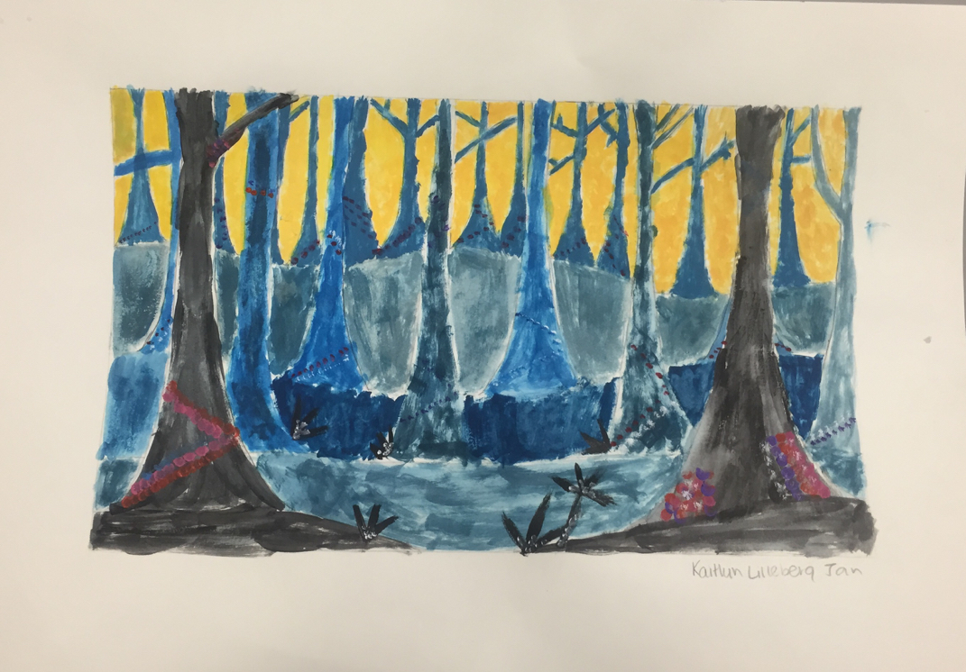
1/23 This is the real final of my spooky trees (including the dots) and added to this was a few bushes and plants to make it look a bit more realistic. This was a very fun project, I am really happy with how this one turned out, I wish I had more time to have done it though.
|
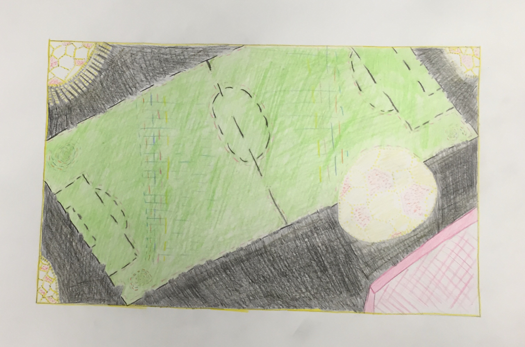
This is my final of my dream time. I used color pencil to do this project. I feel like I should have use some type of paint or pastel instead. But anyways, so I used colored pencil throughout this project. I used bright colors to make it look kind of busy and upbeat, the spots occurring in the top right, left and bottom left corners I created a soccer ball kind of image to act as lights. So the black around the image of the soccer field is trying to portray how it is to play under the lights, so that is why I made the field as bright as it is. Then there is a soccer ball that is dotted out in yellow to make it portray somewhat of a star because that is the item used to play the sport. And then the bottom right corner is a pink goal, and I made the goal pink because that is where the points are scored, so its pink to act like a heart, like the heart of the game because the point of the game is to put the ball in the net. So that is basically what I was trying to portray in this project. The colored pencil probably wasnt the best choice, but its what I used.
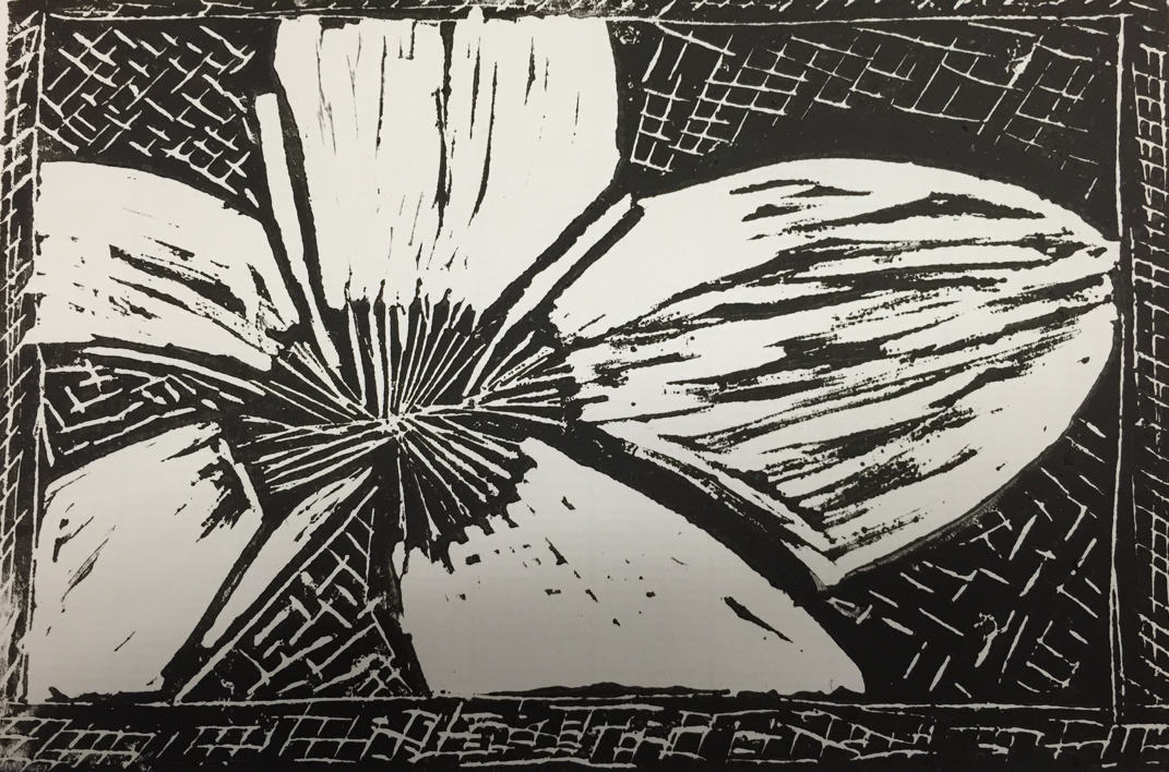
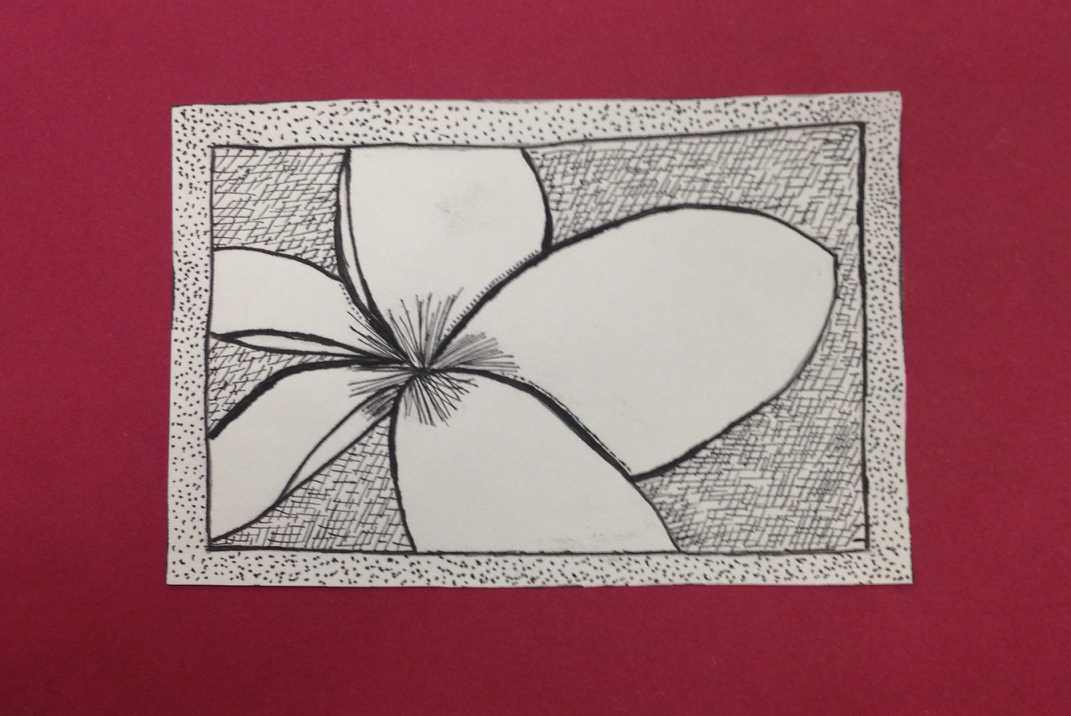
This is my final pen and ink drawing. Finally completed after many many drafts, it is finally done. I am really happy with how this drawing turned out. I used Cross-Hatching for the background behind the flower and then Stippling as the border. Both of the two different patterns help give the flower stand out more. The center is a highlight of an area that shows up dark in the original picture that I had found to use for this project. Then to add value to this picture I drew in the overlapping lines darker to make them stand out and added a little bit of stippling to help give and shadow/edge. By far another of my favorite projects to do.
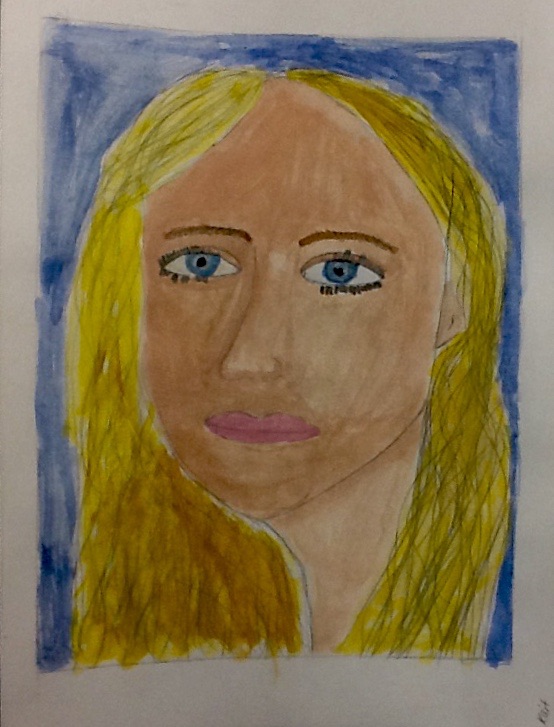
This is my final painting of my portrait. This was difficult for me when it came to adding in highlights to my face. I wasn't sure how to create them in my face. I attempted to use shadowing to show edges of my face. Highlighting was another difficult thing for me to do with this painting as well. I used one of my senior pictures as a picture to go off of to create this portrait painting. The background color is a blue to give a highlight to my eyes and my hair. Somethings I should have done better are with my hair, adding the needed highlights and putting dark where is was supposed to be really dark and then with my face working with highlighting it better.
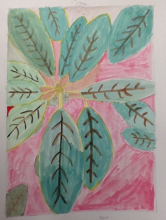
11/10 My Macro Still Life final painting. This was also rather challenging for me, because after I complete the sketch of what I am always worried that I will accidentally make the paint too dark or mix the two wrong colors together. I used the background color and overlapping of leaves to create value and space in my painting. The original picture of this painting (on working blog) shows red leaves in the background, so the red of the background of this painting represents the red leaves in the picture. The more grayish color at the top of the painting represents the sky that shows up in the background of the picture I took and the brown around the center of the leaves is the drink and other assortments of little sticks that also show up in the background of this painting. Overall, I feel this painting went a lot better than the last one. But I still need some more practice.
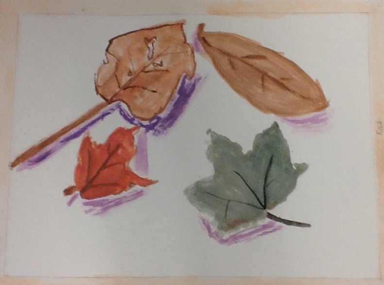
10/31 Macro Still life painting of leaves. 10/31 Macro-still life. This was a more challenging project to do. For this being my first true painting project it is not absolutely amazing. It's definitly a very rough paintting. I used a purple ish color as the shadows so they would not be too dark. I did another with a background color but the background color was a bit too dark so I decided it looked best without a background color. I had to mix colors a lot throughout this painting in order to get a close enough match to the actual leaves themselves. Something I would want to change about this painting would be the way I did my shadows. That needs to be fixed. And I should try and create a background color on it as well. Which I will add, when I turn in the final painting. This was definitely more challenging for me.
|
|
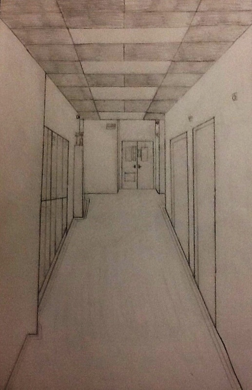
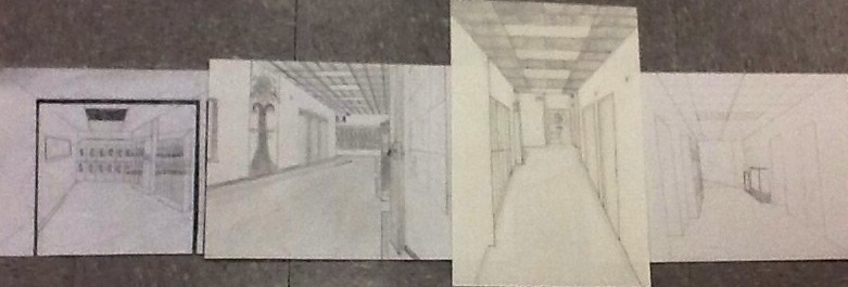
Hallway Drawings 10/22
This drawing took a while to finish, but mine individually I feel like went really well and turned out very good. One point perspective is used throughout this drawing and in 4 of the drawings in the group picture. I drew the hallway that goes down directly across from the art room looking towards the choir room. Throughout this drawing, one-point perspective is used entirely. The use of orthogonal lines was great, for every doorway or locker or anything along the hallway i had to use those towards my vanishing point. This project took a lot of time, but turn out very well. I am very happy with how my drawing turned out.
This drawing took a while to finish, but mine individually I feel like went really well and turned out very good. One point perspective is used throughout this drawing and in 4 of the drawings in the group picture. I drew the hallway that goes down directly across from the art room looking towards the choir room. Throughout this drawing, one-point perspective is used entirely. The use of orthogonal lines was great, for every doorway or locker or anything along the hallway i had to use those towards my vanishing point. This project took a lot of time, but turn out very well. I am very happy with how my drawing turned out.
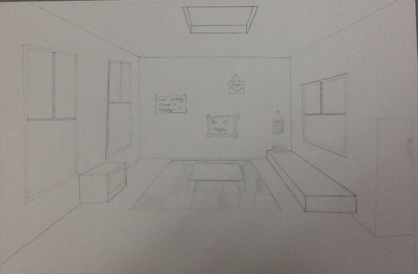
One-Point Perspective Room 10/2
This drawing is obviously of a room. I drew my room as a bedroom. Throughout this drawing one-point perspective is used. Also while drawing each item in this picture orthogonal lines are used to draw the item towards the vanishing point to then put each item into one-point perspective.
This drawing is obviously of a room. I drew my room as a bedroom. Throughout this drawing one-point perspective is used. Also while drawing each item in this picture orthogonal lines are used to draw the item towards the vanishing point to then put each item into one-point perspective.
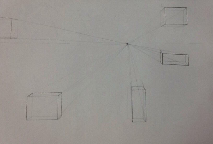
One Point Perspective 9/25
This drawing consists of one off center point connecting to all of the 3D objects drawn within. This drawing was definitely one of the more difficult drawings we have had to do so far this year. It took me many tries in order to get the boxes correctly done following the orthogonal lines going into the vanishing point that is placed off center. One art element used in this drawing would be one point perspective, because everything is leading to one point which is the dot placed a bit off center in this photo plane.
This drawing consists of one off center point connecting to all of the 3D objects drawn within. This drawing was definitely one of the more difficult drawings we have had to do so far this year. It took me many tries in order to get the boxes correctly done following the orthogonal lines going into the vanishing point that is placed off center. One art element used in this drawing would be one point perspective, because everything is leading to one point which is the dot placed a bit off center in this photo plane.
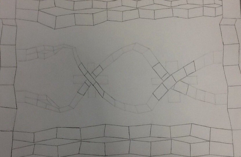
PARALLEL LINE DRAWING 9/22
This drawing is filled with parallelograms. By looking at it you can see a variety of sizes throughout the drawing. Also a variety in the darkness of the lines. From this I learned to use variety in size and in how dark or light the lines are. One art element used throughout this drawing would be is movement.. The drawing looks as if it is moving across the page almost wave like. Overall this drawing was finished within a short amount of time and was not terrible to do.
This drawing is filled with parallelograms. By looking at it you can see a variety of sizes throughout the drawing. Also a variety in the darkness of the lines. From this I learned to use variety in size and in how dark or light the lines are. One art element used throughout this drawing would be is movement.. The drawing looks as if it is moving across the page almost wave like. Overall this drawing was finished within a short amount of time and was not terrible to do.
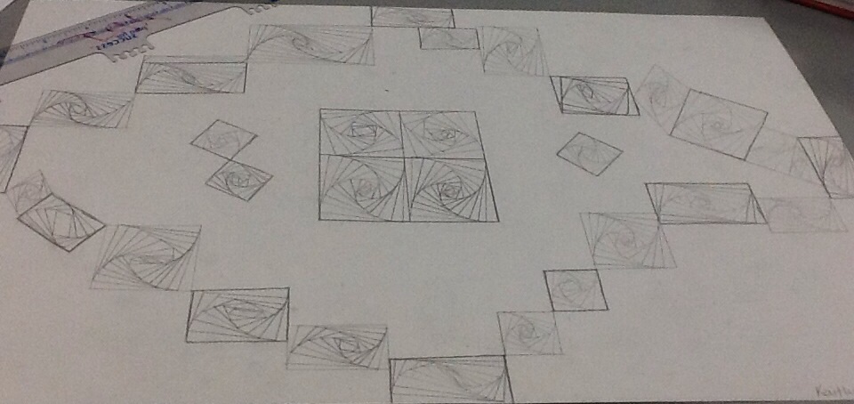
Swirling Squares 9/12
This work is called Swirling Squares. Looking at the finished project you can see how each square looking as if it is actually swirling. 1 new skill I learned from doing this project was how to use lines effectively, by doing light to dark, dark to light, all light, and all dark. 1 art element mostly used is motif. A motif is an element of a pattern. It can also be repeated which it is repeated throughout my artwork. It helped to create something new because first the swirling gave the design some sort of movement, Then moved parts around and created a simple design to create this one art piece.
